For this exercise the idea is to find symbols for a number of concepts and say how you might use them in photographs.
Growth
A city with a large amount of building going on and perhaps with lots of skyscrapers- i.e Take a photograph of a city such as Dubai with an empathises on what is being built and what has already been built showing the two in juxtaposition.
A large pile of money - perhaps to illustrate investment growth.
A seedling which has newly burst into life.
Excess
A very large MacDonald's meal - i.e A photo could be taken of a supersized hamburger and drink from an interesting angle.
Overweight people- probably not politically correct but could be taken at a slimming class!
Crime
A gun
A building which has been broken into with perhaps graffiti- this is perhaps the easiest to photograph-maybe a derelict building with broken windows and graffiti.
Someone being led from court into a police van.
Silence
A library with people studying.
A monastery.
An exam taking place.
A waterfall- Perhaps the easiest to find. A slow shutter speed would blur the water giving a sense of peace/silence.
An early morning tranquil scene of a lake.
Poverty
A beggar.
Third world poverty with a child holding out a bowl for food.
An empty purse- this would be the easiest to photography perhaps with a hand emptying out the purse and a few pence lying on a table.
Saturday, 22 June 2013
Wednesday, 12 June 2013
Evidence of action
For this exercise I decided to show the damage that a snail or snails had done to my sunflowers seedlings. I took this photograph outside in natural light.
For this exercise we were also asked to think about abstract ideas and concepts that are shown in advertising and publicity, which cannot be shown directly. I looked in a few magazines and newspapers I had at hand and here are some I found.
Specsavers - light bulbs planted in plant pot
Clinique mascara - stand out why not? - shoe with very high heel and mascara
Del Monte fruit juice - suitcases packed with tropical fruit
Wednesday, 29 May 2013
A narrative picture essay
This has been an interesting exercise. The photos had a fairly obvious sequence since they were telling a story. I realise now the photographs could have been more interesting if there had been more variety in their size. I also note from what I've read in the course for this section that variety of close and further away shots and also a variety of colour and different lighting can make for a more interesting narrative photo essay.
Monday, 18 February 2013
Stieglitz (1864-1946)
My tutor has suggest that I look at Stieglitz photographs in relation to his use of light at different times of the day.
Albert Stieglitz was a very significant American photographer who was a pioneer over his fifty year career in making phtography an art form. He was"determined to prove photogrpahy was a medium capable of artistic expression as painting or sculpture"
He witnessed New York change from a city with cobblestones to a modern metropolis with skyscrapers. His most famous photogrphs were the Terminal, the Steerage and the O'Keefe portraits.
Friday, 15 February 2013
Edward Weston
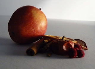
Edward Weston (1886-1958) was a 20th century American photographer. He was considered "one of the most innovative and influential photographers. He photographed a wide range of subject such as still lifes, nudes, landscapes, portraits etc. He wrote something as ordinary or extraordinary as a pepper "takes one beyond the world of the conscious mind". His still life photographs of vegetables inspired me to take some of my own photographs of vegetables and fruit above, something which I have never done before.
The first two photographs were taken using a side light with no diffusion to provide high contrast. I particularly like the abstract nature of the second photograph. The others were taken using a light tent with a low lamp lighting the subjects from the side to emphasise texture. I think the diffused light also produces interesting photographs.
Saturday, 9 February 2013
Contrast and shadow fill
For this exercise I set up a simple still-life and placed a desk light at right angles to my camera which was on a tripod and which was level with the still-life. The photos above are in order of contrast, without a diffuser, with white card two feet away, with white card one foot away, with a shiny foil reflector, with a dull foil reflector and with a crumpled foil reflector and with diffused light using a light tent. I think if I had used a stronger light source the differences might be more obvious. It is however interesting how shadow can be filled using reflectors. Although the diffused photos shows less contrast and is flat it does have very little detail lost in the shadows. I will use what I have learnt above when preparing for my assignment.
Friday, 25 January 2013
The lighting angle
 For this exercise I used a desk lamp, a light tent to diffuse the light and I had my camera on a tripod. Unfortunately I could not have my camera exactly horizontal as suggested as I was using a light tent to diffuse the light and the light tent had a raised edge at the front.
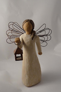
I choose a statue of an angel to photograph because of the sculptural nature of it.
The first three photographs were taken with the lamp at the front, the right, the back and the left of the subject The next three were taken were taken with the light overhead and then slightly in front and then slightly behind the subject. The last four photos were taken with the light pointing down at a 45 degrees angle, moving the light around the object. Image one with the light in front produced a flat image with little detail. Image two with the light at the right hand side showed a definite shadow at the left hand side. More detail in the texture of the image was also shown. Image three with the light at the back produced a silhouette showing shape but no detail. Image four, taken from the left hand side produced a shadow on the right hand side produced a shadow on the left hand side. More detail was shown in the subject. The overhead images, five six and seven seemed to be a little flat to me but did show the form well. I think images nine and eleven with the light at a 45 degree angle pointing down produce good detail of the texture of the object.
Over all I think this has been a very useful exercise to show what qualities of an object can be brought out by different lighting conditions. I like image four of the silhouette of the object best because of its striking nature.
Subscribe to:
Comments (Atom)


