Thursday, 7 October 2010

Positioning a point


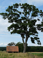
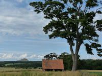
I have taken three photographs in which where is a single point, a haystack, has been placed in different parts of the frame.


I thought I would try the three classes of position mentioned in the exercise, placing a point off centre, to the edge of the frame and in the centre. I like the off centre one best particularly as the point is a haystack which looks like it could roll down the hill. As mentioned in The Photographer's Eye placing a point in the centre of the frame can seem static and therefore a decision has to be made how far off the centre of the frame and in what direction you place the point. This might also be dictated by what else is in the photograph as it is rare to find a completely plain or even background. I think the photograph in the middle doesn't work well as the trees in the background are distracting.

Points


I think the following would make a clear photograph of a point:- a single flower, tree, haystack, building, boat, bird, animal, vehicle, person etc set against a plain background.


I looked through past photographs I have taken and realise that not many of them contain obvious points! The two above however do. I will try in the future to look out for more situations where this applies.


Monday, 9 August 2010

Cropping


As suggested in this exercise I looked at three photographs with a view to cropping them. Two of them are shown here.
I cropped the first photograph shown in this way to emphasize the subject of the photograph - a peaceful river scene taken in the Autumn. I cropped the photos to remove the houses at the top which were a distraction and then balanced the photograph by removing part of the foreground which had no interest in it. I also straightened the image.
In the second photograph I cropped the photograph to remove the house and light shown on the left hand side. I wanted the photograph to be just of the ferry and they were a distraction at the side of it.
Cropping as suggested in this exercise is not a panacea for correcting "bad" shots but is a useful tool nonetheless to remove unwanted objects and distracting detail.


Sunday, 25 July 2010

Vertical and horizontal frames


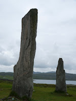
I took numerous photographs in vertical and horizontal formats and have included three pairs of them above.
I tried not to let the restriction of the project make me only consider tall subjects although the vertical format naturally lends itself to tall subjects. An example of this is the photograph above of the standing stones of Callanish on the Isle of Lewis. The vertical format in this case is more dramatic but does however give less context as to where the subject is in relation to the background compared to the horizontal format. I think this could be an advantage or disadvantage depending on the nature of the photograph. The vertical format does allow the photographer to give more prominence to the subject without unwanted elements being included in the photograph.
I did find a tendency, as mentioned in the exercise to position the main weight of the subject in the lower part of the frame as shown above in the photo of the two cottages.
I can see the benefit of trying both formats. It was interesting to read in Michael Freeman's "The Photographers Eye" that we tend to shoot mostly in a horizontal format as that is the way cameras are designed and what is most comfortable for the photographer. He also makes the point that the human vision naturally allows us to see the world in a horizontal way. I will however endeavour to try taking more vertical shoots!


Wednesday, 14 July 2010

Placing the Horizon


It is evident from this exercise that where the horizon is placed in a photograph has a powerful effect on how the composition of it is viewed. By changing the horizon the entire balance of the photograph appears very different.
I took six photos in Greece, three of which are shown above, considering the different position of the horizon.
The first one with the horizon high in the frame accentuates the foreground detail of the water and pebbles and enhances a sense of distance.
The second one, although breaking the "rule" of two thirds, I think works okay although it does provided a more static photograph and perhaps confuses the viewer as to what part of the photograph to be drawn towards.
The third one obviously give much more prominence to the sky which unfortunately in this case is not particularly interesting. This format would be much better for an image containing a dramatic sky or sunset. Hence it works much better in the bottom picture, which was taken a couple of weeks ago on the isle of Harris in the Scottish Islands, as the sky is much more dramatic.

Update

I am now quite far on in completing my first assignment-at last! It has been difficult for me due to my camera breaking earlier on in the year and my continuing health problems and being away. This has made it impossible to complete a weekly blog.

I had a frustrating day yesterday trying to take photographs. It was a beautiful sunny day and I was driving along country roads and saw some lovely shades of colours in different fields and beautiful skies and silhouetted trees on the horizon and in different fields but it was impossible to stop the car anywhere! I did see one amazingly shaped dead tree that I am determined to go back and find some way of photogrphing!

Today I've order Micheal Freemans "The Photographer's Eye" which I am looking forward to reading and I am also going to renew my suscription to the Digital Photography magazine.

Saturday, 10 July 2010

Balance


I understand from this exercise that balance in a photograph can be achieved in many different ways whether it be by the placement or size of the subject or objects in it or by tone or colour etc. I looked at my photographs and some automatically "jumped out " at being being better balanced than other. As mentioned in the course it seemed much easier to find balance in photographs with a simple composition. The photos above I considered to be balanced in different ways and it was useful to sketch the weighing scales.
From reading further on the subject there seems to be varying methods of achieving balance in the composition of photos.
One being how the elements of an image are divided by vertical or horizontal axis.
Another being symmetrical balance i.e. two objects of equal weight are positioned on either side of the vertical dividing line.
The most interesting is using asymmetrical balance. This works on the premise that objects have their own "mass" whether it's size, colour, tone, in focus etc. A well balanced photograph would have the different elements in it arranged in such a way that their "mass or weight" is balanced. One example of the weight of a component in a photogrpah is that objects in focus take precendence over out-of-focus objects.